Methodical UI: removing frustration from HTML and CSS development

Maybe you're a developer. Maybe you're a designer. Maybe you're a software project manager. Chances are that you're dealing with at least a bit of HTML and/or CSS during a typical work week. What's your workflow for that? If you're like most honest people, your answer is: "it depends." In the past, my workflow looked a bit like this:
- Do the thing
- Do another thing
- Thing 1 is messed up so I need to do it again but differently now
- Adjust spacing on thing 2
- The way I was gonna do the next thing is now not going to work for some reason ...
42. Done! Just don't ask how
Maybe this sounds familiar? If it's working for you, that's great! The rest of this article is probably not for you. But if you're tired of tying your virtual shoelaces together, there are two ways to make this process less painful:
- Get better at HTML and CSS
- Structure your workflow to minimize having to go back and fix things that were working fine before
Option 1 will work very well. Fluency with HTML and CSS will grant you much more command over the web browser and reduce the amount of times you run into dead ends in the development process. Improving your skills will also facilitate quick recovery from setbacks. But absent a reliable workflow, setbacks are still inevitable. In the swirling vortex of uncertainty that is user interface development, a structured approach is the key to sustainable, predictable, and manageable progress.
Why HTML and CSS can be so frustrating
Let's get one thing out of the way: coding can be frustrating no matter what you're trying to build. HTML and CSS, though, are frustrating in ways that are distinct from other software-creation tasks. And that frustration isn't unique to a single type of worker. If you're used to creating interfaces in a GUI or WYSIWYG such as those provided by Adobe, InVision, and others, using a text editor in order to express your ideas may feel cumbersome and opaque. If you're a software developer, you may be more comfortable creating things that operate in a world of black-and-white: either the program works according to spec or it doesn't.
Remember, coding in HTML and CSS produces a formatted, styled document; coding in a programming language produces a program. Because these media are so different, it's only natural that folks who have put a lot of time into the latter might find the former to feel like a chore.
That's not to say programming isn't difficult. Seasoned professionals can struggle for months trying to turn input X into output Y. At the end of the day, though, programmers can rely on tools such as unit tests, integration tests, and end-to-end tests in order to remove uncertainty from the creative process. If your test suite is well-written and all the tests pass, then the team can be fairly confident that the program meets its requirements.
HTML and CSS offer no such comfort. Robust test suites for validating colors, fonts, positioning, and other peculiar aspects of user interfaces simply don't exist. Just as da Vinci couldn't ask a machine whether Mona Lisa was ready for the public - though I'm sure he probably sketched such a machine at some point - UI developers must also determine the correctness of their work by manually inspecting it. Instead of a single canvas, however, we must check our work on a variety of media, any or all of: phones, tablets, laptops, desktops, screen readers, smart TVs and game consoles. The lack of computable acceptance criteria and the diversity of media that can view a hypertext document makes HTML and CSS a frustratingly imprecise art.
There is no reason to despair, though. Despite HTML and CSS's limitations, we can borrow ideas from programming best practices in order to add structure to the UI development process. Whether you're a dyed-in-the-wool front-end developer, a hobbyist, a designer who dabbles, or a project manager that needs to ship an A/B test every now and then, a methodical approach can keep you reasonably certain that the code you're writing now is not messing up the code you've already written.
What you need to know
A methodical approach to HTML and CSS development rests on a foundational understanding of
CSS's display property. I cannot overstate how important this concept is. As a quick
refresher, here's to what I'm referring:
.my-element {
  display: block;
}
Though block is one of many possible values that can be assigned to an element's
display property, we will focus on inline and block (including "block-like")
elements.
Inline elements
Inline elements can be simply described as "linear." By default, they will take as much horizontal space as necessary until reaching the maximum width allowed by their container, at which point they will overflow into a line break (by default). Conceptually, inline elements have no set height or width; instead, they will take up only the space that they require.

Block elements
Block elements are not linear; in fact, they are rectangles. As such, they often behave more intuitively than inline elements in the web browser, which is an inherently two-dimensional medium. These types of elements are the ones that respect the CSS box model: they have defined width, height, positioning, and spacing.

Attribution: Matthias Apsel
Caveat emptor
Well, that was simple, right? Inline is like a line and block is like a box. As a
reminder, though: there
are many other possible values for display. A few possibilities include:
inline-block, table, flex, grid, and inline-flex.
These types of elements, however, will
generally fall under one of the two semantic categories we previously discussed.
According to the
W3C spec, CSS3's
display property is overloaded. There are inner display types and
outer display types. In most cases, your favorite display value is actually block on
the outside and something else on the inside (flex is the poster child for this).
To complicate things further, there are six types of display
values: outside, inside, listitem, internal, box, and legacy. Please feel free to spend
the rest of your day nerding out inside the W3C spec but we have a job to do, so
let's move on. Suffice it to say that, despite the diversity in the CSS3 specification for
display, boiling down our process to inline and block elements is sufficient for all
but the most arcane of edge cases.
Inline vs. block idioms
I said before that understanding inline vs. block is the foundational principle of this method. Now let's dive a little deeper into the types of properties that are idiomatic of these elements, then we'll unpack what this means for your user interface development workflow.
| Idiomatic properties of element types: | |
|---|---|
| Inline | Block |
|
|
Now what do we mean when we say "idiomatic?" It's not like you can't declare a color
inside a block-level element, after all. The big idea to take away from this
not-at-all-exhaustive chart is that block-level elements should be selected for styles
that target properties of boxes, and inline-level elements should be selected for styles
that target properties of lines of content (usually text). Adding non-idiomatic
styles to a given element will create conditions that are ripe for having to go back
and fix something later.
Buttons, media, and form elements are block elements
You heard me. User agents typically give these types of elements specialized
display values, but developers should be wary of passively accepting these
browser-assigned defaults. Since we expect images, inputs, and videos to have
height, width, and to behave predictably in a layout that supports multiple screen
sizes, the only sensible course of action is to treat these elements as plain
ol' block elements.
Methodical UI in seven steps
With our inline vs. block distinction fresh in our minds, let's walk through seven steps that will guide us through UI development using HTML and CSS with minimal frustration. For the purposes of this example, I will be using React with JSX. It's very similar to HTML so hopefully nothing gets lost in translation.
Example spec
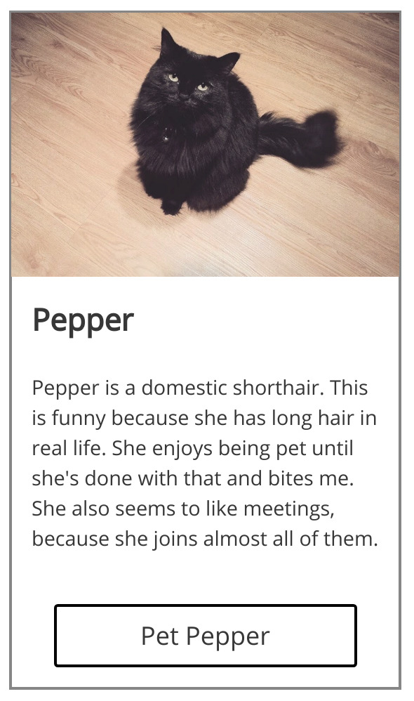
We will be using this simple design comp as our "spec" to implement using our seven steps. Behold:
For simplicity's sake, we won't be listing all the different quantitative values like
font-size - just trust that we're using the "correct" values in the following demonstration.
Step 1: Content
Get all the content on the page, with the bare minimum of markup necessary. Media tags and form element tags will be necessary, but nothing more - we simply want to write no more HTML than is absolutely necessary to display the elements with which we will be working.
import React from 'react';
import pepper from './pepper.jpg';

const App = () => {
  return (
    <div>
      <img
        src={pepper}
        alt='Pepper'
      />
      Pepper
      Pepper is a domestic shorthair.  This is funny because she has
      long hair in real life.  She enjoys being pet until she's done with
      that and bites me.  She also seems to like meetings, because she
      joins almost all of them.
      <button
        type='button'
      >
        Pet Pepper
      </button>
    </div>
  );
};

export default App;
This sounds simple, but your spec may contain dynamic content. If that is the case with your feature, the least-disruptive choice would be to hardcode the most complex content that is possible given the requirements.
By getting your final (or one possible version of the final) content all on the page, we ensure that we are not forgetting anything. Include any content that is breakpoint-specific; if something is shown on wide screens but not small screens, include it on the page here. We can work on media queries and hide/show logic later in the process.
Step 2: Semantics
Enclose content in semantic HTML tags. Don't worry about layout considerations - this is where we add anchors, headings, paragraphs, lists, and tables.
import React from 'react';
import pepper from './pepper.jpg';

const App = () => {
  return (
    <div>
      <img
        src={pepper}
        alt='Pepper'
      />
      <h2>
        Pepper
      </h2>
      <p>
        Pepper is a domestic shorthair.  This is funny because she has
        long hair in real life.  She enjoys being pet until she's done with
        that and bites me.  She also seems to like meetings, because she
        joins almost all of them.
      </p>
      <button
        type='button'
      >
        Pet Pepper
      </button>
    </div>
  );
};

export default App;
Note that we have enclosed the heading text inside an h2 tag and the copy text
inside a p tag. In so doing, we are making strides toward
valid and accessible markup. These tags will be consistent across all breakpoints,
so there is no need to consider responsiveness at this time.
Step 3: Layout
This step is a bit more involved. We will organize our semantic markup into the
appropriate layout-oriented tags in order to set ourselves up for success when
we begin adding stylesheets. Identify which parts of your markup could be considered
headers, sections, footers, navigation elements, articles, etc. and wrap them
in the
appropriate semantic HTML tag.
Be deliberate about choosing which tag to use, and feel free to use <div> if no
semantic purpose is evident. Follow these directives for best results:
- Focus on the smallest supported screen width and don't worry about CSS yet. The page will still look incomplete throughout this step.
Media and interactive elements such as images, videos, inputs, and selects must be wrapped in at least one
div. When in doubt, use more wrappers than necessary. Positioning media elements can be tricky down the line, and you'll be doing yourself a favor by giving yourself some containers to work with, ensuring the best fit for your media on a variety of screen sizes.<!-- not recommended --> <img src="/foo.jpg" /> <!-- recommended --> <section> <!-- will be used to position the element in the document flow --> <div> <!-- will be used to constrain / crop / letterbox the media to the desired size --> <img src="/foo.jpg" /> </div> </section><!-- not recommended --> <label for="foo">Foo</label> <input type="text" name="foo" id="foo" /> <!-- recommended --> <div> <section> <label for="foo">Foo</label> </section> <section> <input type="text" name="foo" id="foo" /> </section> </div>Text nodes must be direct descendants of inline elements and must never be direct descendants of block elements. Remember that inline and block elements are fundamentally different and should be styled as such. We will style the text content using a selector given to the
span(inline) element, and we will style the box surrounding that text via a selector assigned to theh1(block) element:<!-- not recommended --> <h1> Foo </h1> <!-- recommended --> <h1> <span> Foo </span> </h1>For clarity's sake,
Foois considered a text node. It's not quite an HTML element, but it is an entity inside the DOM. When I refer to text nodes, I simply am talking about text content inside HTML elements.Sibling elements should never have different
displayvalues. In other words, don't put aninlineelement next to ablockelement:<!-- not recommended --> <div> <section> <!-- block sibling --> <img src="/bar.png" /> </section> <span> <!-- inline sibling --> Bar </span> </div> <!-- recommended --> <div> <section> <!-- block sibling --> <img src="/bar.png" /> </section> <section> <!-- block sibling --> <span> Bar </span> </section> </div>A must have a direct descendant that is a
div, and thatdivshould contain all content inside the button. We will almost always position thatdivabsolutely so that the content of the button doesn't produce any unexpected layout changes. In other words, we're making sure if the button breaks, nothing else will break as a result:<!-- not recommended --> <button> Tap me </button> <!-- recommended --> <button> <div> <span> Tap me </span> </div> </button>
Here's our source code so far:
import React from 'react';
import pepper from './pepper.jpg';

const App = () => {
  return (
    <div>
      <div>
        <section>
          <div>
            <img
              src={pepper}
              alt='Pepper'
            />
          </div>
        </section>
        <section>
          <header>
            <h2>
              <span>
                Pepper
              </span>
            </h2>
          </header>
          <section>
            <p>
              <span>
                Pepper is a domestic shorthair.  This is funny because she has
                long hair in real life.  She enjoys being pet until she's done with
                that and bites me.  She also seems to like meetings, because she
                joins almost all of them.
              </span>
            </p>
          </section>
          <footer>
            <div>
              <div>
                <button
                  type='button'
                >
                  <div>
                    <span>
                      Pet Pepper
                    </span>
                  </div>
                </button>
              </div>
            </div>
          </footer>
        </section>
      </div>
    </div>
  );
};

export default App;
The next step is where we begin using CSS. Word to the wise: target the smallest supported screen size only during this and subsequent steps. We will add styles for larger screen sizes eventually, but this method works best when you complete your small-screen styles first and then work your way up to the largest supported screen size. This encourages the developer to confine larger-screen styles inside media query scopes, thus reducing the likelihood of having to modify previously-written code that was working properly.
Step 4: Style inline elements
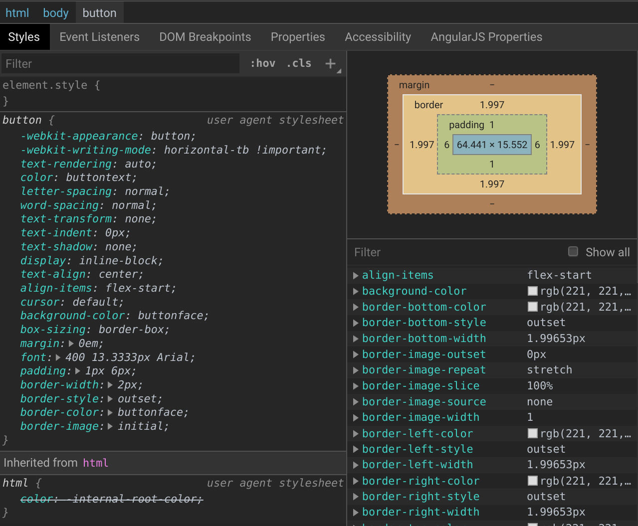
For the smallest supported screen size only, ensure all inline elements are styled according to the specification. Font properties, letter spacing, line heights, and colors are all fair game. The table earlier in this article is a useful resource.
Because we are targeting only these types of styles, it should become more
apparent why we enclose all text nodes inside a span element:
<!-- not recommended -->
<h1 class="heading">
  Hello world!
</h1>
<style>
.heading {
  color: #333;
  font-family: 'Open Sans', sans-serif;
  font-size: 36px;
  font-weight: bold;
  letter-spacing: 1.5px;
  line-height: 1.35;
  margin: 0 auto;
  padding: 8px 16px;
  text-align: center;
}
</style>
By putting nine rules inside the .heading selector, we have
obscured its purpose. Both the descendant inline text node and
its containing h1 block are being styled and are therefore
coupled with one another unnecessarily. We can resolve this issue
by adding a span:
<!-- recommended -->
<h1 class="heading">
  <span class="text text--xl">
    Hello world!
  </span>
</h1>
<style>
.text {
  color: #333;
  font-family: 'Open Sans', sans-serif;
  line-height: 1.35;
}

.text--xl {
  font-size: 36px;
  font-weight: bold;
  letter-spacing: 1.5px;
}

.heading {
  margin: 0 auto;
  padding: 8px 16px;
  text-align: center;
}
</style>
By making our selectors more terse and separating the concerns of inline vs block styles, we make the stylesheet more readable in a way that suggests an intuitive markup structure. In other words, I can read the HTML and have a good clue as to what the CSS is like and I can read the CSS and have a good clue as to what the HTML is like.
With that principle in mind, let's take a look at our source code now:
import React from 'react';
import pepper from './pepper.jpg';
import './App.css';

const App = () => {
  return (
    <div>
      <div>
        <section>
          <div>
            <img
              src={pepper}
              alt='Pepper'
            />
          </div>
        </section>
        <section>
          <header>
            <h2>
              <span className='text text--copy text--lg'>
                Pepper
              </span>
            </h2>
          </header>
          <section>
            <p>
              <span className='text text--copy text--sm'>
                Pepper is a domestic shorthair.  This is funny because she has
                long hair in real life.  She enjoys being pet until she's done with
                that and bites me.  She also seems to like meetings, because she
                joins almost all of them.
              </span>
            </p>
          </section>
          <footer>
            <div>
              <div>
                <button
                  type='button'
                >
                  <div>
                    <span className='text text--md'>
                      Pet Pepper
                    </span>
                  </div>
                </button>
              </div>
            </div>
          </footer>
        </section>
      </div>
    </div>
  );
};

export default App;
.text {
  font-family: 'Open Sans', sans-serif;
  line-height: 1.5;
}

.text--copy {
  color: #333;
}

.text--sm {
  font-size: 16px;
}

.text--md {
  font-size: 20px;
}

.text--lg {
  font-size: 24px;
}
Step 5: Style media and interactive elements
Buttons, images, videos, inputs, selects, and other types of interactive elements aren't inline elements, nor are they used to structure larger layout patterns like some of the more conventional block elements. Because these elements are so crucial to building web applications, they can also be finicky and inconsistent from browser to browser. Be sure to follow the guidelines set forth earlier in this article with regard to button and media markup structure.
Getting down into the details of all the possibilities here might make this already-long article even longer, so I will save that subtopic for a future post. Image/media positioning is a fairly well-tread subject in the community so I'm confident you as the reader will navigate that successfully. I would, however, like to get in a word about buttons. As a refresher, let's take a look at a sample button:
<button class="button">
  <div class="button__content-container">
    <span class="text text--white text--sm">
      Tap Me
    </span>
  </div>
</button>
This seems like an awful lot of pomp for a simple button. But what happens if we simplify it? I mean, how bad could the following be?
<button class="button">
  <span class="text text--white text--sm">
    Tap Me
  </span>
</button>
The answer lies in what happens with your dynamic content, and our conceptual
modeling of what a button actually represents. Consider this set of styles:
.button {
  appearance: none;
  background-color: #00f;
  border: none;
  border-radius: 2px;
  display: block;
  height: 24px;
  outline: none;
  margin: 0 auto;
  padding: 0;
  width: 100%;
}

.text {
  font-family: 'Open Sans', sans-serif;
  font-weight: normal;
}

.text--white {
  color: #fff;
}

.text--sm {
  font-size: 16px;
}
This would work fine for the time being. But what happens if you change
the size of .text--sm from 16px to 17px? How would that affect the
rendered height of your .button or the positioning of the text inside of
it? Even if you are fluent in CSS, your code doesn't make the answer clear
to the reader, which is a warning sign that you might end up inadvertently
breaking a layout down the line. That's why we have the extra div inside:
.button {
  appearance: none;
  background-color: #00f;
  border: none;
  border-radius: 2px;
  display: block;
  height: 24px;
  outline: none;
  margin: 0 auto;
  padding: 0;
  position: relative;
  width: 100%;
}

/* wraps the text content */
.button__content-container {
  bottom: 50%;
  margin: 0;
  padding: 8px;
  position: absolute;
  right: 50%;
  transform: translate(50%, 50%);
  width: 100%;
}

.text {
  font-family: 'Open Sans', sans-serif;
  font-weight: normal;
}

.text--white {
  color: #fff;
}

.text--sm {
  font-size: 16px;
}
Because our .button__content-container is absolutely positioned and
centered, any
change in its descendant elements will not affect the layout of .button.
Whether it's dynamic content or a change in font-size or spacing, the
absolutely-positioned container gives us an insurance policy against
accidental breakage.
With that note, let's inspect our source code after step 5:
import React from 'react';
import pepper from './pepper.jpg';
import './App.css';

const App = () => {
  return (
    <div>
      <div>
        <section className='image'>
          <div className='image__container'>
            <img
              src={pepper}
              alt='Pepper'
              className='image__img'
            />
          </div>
        </section>
        <section>
          <header>
            <h2>
              <span className='text text--copy text--lg'>
                Pepper
              </span>
            </h2>
          </header>
          <section>
            <p>
              <span className='text text--copy text--sm'>
                Pepper is a domestic shorthair.  This is funny because she has
                long hair in real life.  She enjoys being pet until she's done with
                that and bites me.  She also seems to like meetings, because she
                joins almost all of them.
              </span>
            </p>
          </section>
          <footer>
            <div className='button'>
              <div className='button__container'>
                <button
                  type='button'
                  className='button__btn'
                >
                  <div className='button__content'>
                    <span className='text text--md'>
                      Pet Pepper
                    </span>
                  </div>
                </button>
              </div>
            </div>
          </footer>
        </section>
      </div>
    </div>
  );
};

export default App;
.text {
  font-family: 'Open Sans', sans-serif;
  line-height: 1.5;
}

.text--copy {
  color: #333;
}

.text--sm {
  font-size: 16px;
}

.text--md {
  font-size: 20px;
}

.text--lg {
  font-size: 24px;
}

.image__container {
  width: 100%;
}

.image__img {
  display: block;
  width: 100%;
}

.button__container {
  height: 50px;
  margin: 0 auto;
  max-width: 240px;
  width: 100%;
}

.button__btn {
  appearance: none;
  background: #fff;
  border-color: #000;
  border-style: solid;
  border-width: 2px;
  border-radius: 3px;
  color: #333;
  display: block;
  height: 100%;
  padding: 0;
  position: relative;
  width: 100%;
}

.button__btn:focus,
.button__btn:hover {
  background: #000;
  color: #fff;
  outline: none;
}

.button__btn:active {
  box-shadow: 0 0 10px 2px #aaa;
  outline: none;
}

.button__content {
  bottom: 50%;
  position: absolute;
  text-align: center;
  transform: translateY(50%);
  width: 100%;
}
Step 6: Style block elements
You may notice that we have "started small." First, text nodes; then, some larger and more complex elements. This is intentional: layouts cannot be adequately styled if their consituent elements are not styled. Many a developer, including myself, have tied their shoelaces together by styling their layouts before locking down the final dimensions of the content itself.
For the smallest supported screen size, ensure your layout-oriented block elements are styled with the appropriate values for positioning, padding, margins, flex values, and the like.
Our source code so far:
import React from 'react';
import pepper from './pepper.jpg';
import './App.css';

const App = () => {
  return (
    <div className='container'>
      <div className='card'>
        <section className='card__image image'>
          <div className='image__container'>
            <img
              src={pepper}
              alt='Pepper'
              className='image__img'
            />
          </div>
        </section>
        <section className='card__content content'>
          <header className='content__header'>
            <h2 className='content__heading'>
              <span className='text text--copy text--lg'>
                Pepper
              </span>
            </h2>
          </header>
          <section>
            <p className='content__p'>
              <span className='text text--copy text--sm'>
                Pepper is a domestic shorthair.  This is funny because she has
                long hair in real life.  She enjoys being pet until she's done with
                that and bites me.  She also seems to like meetings, because she
                joins almost all of them.
              </span>
            </p>
          </section>
          <footer className='content__footer'>
            <div className='button'>
              <div className='button__container'>
                <button
                  type='button'
                  className='button__btn'
                >
                  <div className='button__content'>
                    <span className='text text--md'>
                      Pet Pepper
                    </span>
                  </div>
                </button>
              </div>
            </div>
          </footer>
        </section>
      </div>
    </div>
  );
};

export default App;
.container {
  margin: 0 auto;
  max-width: 900px;
  padding: 32px 32px 0;
  position: relative;
  width: 100%;
}

.text {
  font-family: 'Open Sans', sans-serif;
  line-height: 1.5;
}

.text--copy {
  color: #333;
}

.text--sm {
  font-size: 16px;
}

.text--md {
  font-size: 20px;
}

.text--lg {
  font-size: 24px;
}

.card {
  border: 2px solid #888;
  display: flex;
  flex-direction: column;
  width: 100%;
}

.card__image {
  flex: 0 1 auto;
}

.card__content {
  flex: 0 1 auto;
  padding: 16px;
}

.content__header {
  padding-bottom: 8px;
}

.content__heading {
  margin: 0 auto;
  padding: 0;
}

.content__footer {
  padding-top: 24px;
}

.image__container {
  width: 100%;
}

.image__img {
  display: block;
  width: 100%;
}

.button__container {
  height: 50px;
  margin: 0 auto;
  max-width: 240px;
  width: 100%;
}

.button__btn {
  appearance: none;
  background: #fff;
  border-color: #000;
  border-style: solid;
  border-width: 2px;
  border-radius: 3px;
  color: #333;
  display: block;
  height: 100%;
  padding: 0;
  position: relative;
  width: 100%;
}

.button__btn:focus,
.button__btn:hover {
  background: #000;
  color: #fff;
  outline: none;
}

.button__btn:active {
  box-shadow: 0 0 10px 2px #aaa;
  outline: none;
}

.button__content {
  bottom: 50%;
  position: absolute;
  text-align: center;
  transform: translateY(50%);
  width: 100%;
}
Your UI should now appear pixel-perfect on the smallest screen size you support!
Step 7: Repeat for each breakpoint
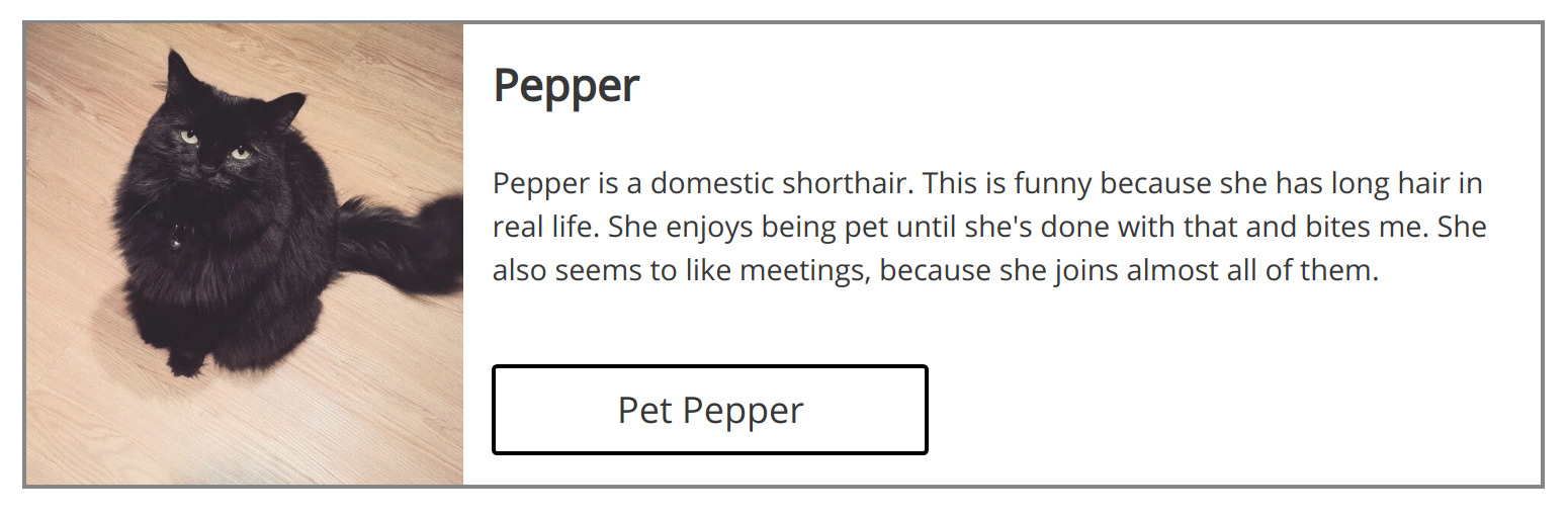
Go through step 4, step 5, and step 6 again at each specified breakpoint. Our example spec has a single breakpoint, but many designs will specify layouts for mobile phone-sized screens, tablet-sized screens, laptop-sized screens, and maybe one for extra-wide screens.
Happily, since we are certain our styles for our smallest screen work as expected, we can nest all subsequent styles inside a media query and be confident that none of the work we've done so far will be affected by this step:
.text--sm {
  font-size: 16px;
}

/* approx. width of portrait-oriented tablet */
@media screen and (min-width: 768px) {
  .text--sm {
    /* will not affect anything we've already done! 🎉 */
    font-size: 18px;
  }
}
Our final source code:
import React, { useState } from 'react';
import pepper from './pepper.jpg';
import './App.css';

const App = () => {
  const [pets, addPet] = useState(0);

  return (
    <div className='container'>
      <div className='card'>
        <section className='card__image image'>
          <div className='image__container'>
            <img
              src={pepper}
              alt='Pepper'
              className='image__img'
            />
          </div>
        </section>
        <section className='card__content content'>
          <header className='content__header'>
            <h2 className='content__heading'>
              <span className='text text--copy text--lg'>
                Pepper
              </span>
            </h2>
          </header>
          <section>
            <p className='content__p'>
              <span className='text text--copy text--sm'>
                Pepper is a domestic shorthair.  This is funny because she has
                long hair in real life.  She enjoys being pet until she's done with
                that and bites me.  She also seems to like meetings, because she
                joins almost all of them.
              </span>
            </p>
          </section>
          <footer className='content__footer'>
            <div className='button'>
              <div className='button__container'>
                <button
                  type='button'
                  className='button__btn'
                  onClick={() => {
                    const newPets = pets + 1;
                    addPet(newPets);
                    alert(`Pepper successfully petted. Total pets: ${newPets}`);
                  }}
                >
                  <div className='button__content'>
                    <span className='text text--md'>
                      Pet Pepper
                    </span>
                  </div>
                </button>
              </div>
            </div>
          </footer>
        </section>
      </div>
    </div>
  );
};

export default App;
.container {
  margin: 0 auto;
  max-width: 900px;
  padding: 32px 32px 0;
  position: relative;
  width: 100%;
}

.text {
  font-family: 'Open Sans', sans-serif;
  line-height: 1.5;
}

.text--copy {
  color: #333;
}

.text--sm {
  font-size: 16px;
}

.text--md {
  font-size: 20px;
}

.text--lg {
  font-size: 24px;
}

.card {
  border: 2px solid #888;
  display: flex;
  flex-direction: column;
  width: 100%;
}

.card__image {
  flex: 0 1 auto;
}

.card__content {
  flex: 0 1 auto;
  padding: 16px;
}

.content__header {
  padding-bottom: 8px;
}

.content__heading {
  margin: 0 auto;
  padding: 0;
}

.content__footer {
  padding-top: 24px;
}

.image__container {
  width: 100%;
}

.image__img {
  display: block;
  width: 100%;
}

.button__container {
  height: 50px;
  margin: 0 auto;
  max-width: 240px;
  width: 100%;
}

.button__btn {
  appearance: none;
  background: #fff;
  border-color: #000;
  border-style: solid;
  border-width: 2px;
  border-radius: 3px;
  color: #333;
  display: block;
  height: 100%;
  padding: 0;
  position: relative;
  width: 100%;
}

.button__btn:focus,
.button__btn:hover {
  background: #000;
  color: #fff;
  outline: none;
}

.button__btn:active {
  box-shadow: 0 0 10px 2px #aaa;
  outline: none;
}

.button__content {
  bottom: 50%;
  position: absolute;
  text-align: center;
  transform: translateY(50%);
  width: 100%;
}

@media screen and (min-width: 768px) {
  .card {
    flex-direction: row;
  }

  .card__image {
    flex: 0 0 240px;
  }

  .image__container {
    overflow: hidden;
    height: 100%;
    position: relative;
    width: 100%;
  }

  .image__img {
    height: 100%;
    position: absolute;
    right: 50%;
    transform: translateX(50%);
    width: auto;
  }

  .button__container {
    margin-left: 0;
  }
}
Once you've finished this process for all supported screen sizes, the next step is up to your judgment. If your content is dynamic, you'll want to make sure that your dynamism is implemented and test your new UI with a cross-section of possible content.
Have you been checking your UI in multiple browsers throughout this process? If not, better fire up Safari and IE and get to work now before you deploy your 🔥 HTML and CSS to production.
Summary
We started by incrementally turning raw content into idiomatic,
valid, and accessible markup. Inline content was properly enclosed
in spans and/or other appropriate elements. Block content was duly
enclosed in one of the many different types of tags that HTML5 gives
us for a number of purposes. Block-like elements such as inputs
and images were coerced into becoming block elements with their own
purpose-driven, self-contained layouts within. Support for
progressively wider screen sizes was incrementally added inside of
media query scopes so as to avoid introducing regressions into our
source code.
As with any simplified example, real-world workflows will necessarily vary with the types of interfaces the developer is working on. The principles set forth in this article, though, will provide a sensible guideline for safeguarding against common frustrations endemic to front-end development.
Wrapping it up
I am eager to learn whether this process has helped anyone in real life, so please don't hesitate to reach out and start a dialogue on what's working and what isn't.
I would like to acknolwedge Joseph Alfonso's contributions - his perspective helped to polish the prose in this article.
Keep the conversation going
I really appreciate feedback from anyone and everyone who reads my posts, so please feel free to say hi at @jeff.auriemma.xyz and keep the conversation going.